Forecast: Where is Dow Jones Industrial Average Heading as of March 29, 2019

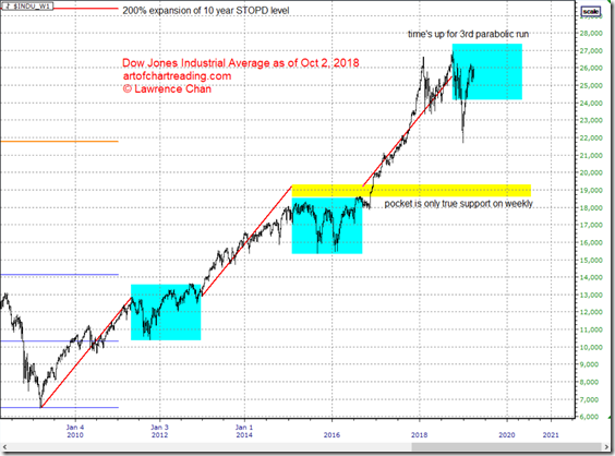
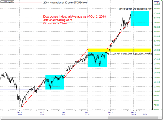
Last time I posted a chart about Dow was back in October 2, 2018. The chart is like this.

image

What I said in the post worked out pretty well.

Here is an update of the same chart.

image

Notice the sharp drop ended abruptly where – the 100% expansion level (orange horizontal line).

So what can we expect from here?

Several scenarios can play out. All of them bearish.

First, given the sharp drop, a potential Adam and Eve formation is in the making.This means Dow can continue to drift higher including a retest of the all time high but it will ended up selling off sharply and likely to break the year 2018 correction low.

Second, if a serious sell off starts in 2 week (early to mid April 2019), it will be the second leg of the correction started in year 2018. In this case, a push down to below 21000 is reasonable.

Third, a higher high against the all time high that fails to stay above that on weekly and monthly closing basis. That will trigger massive unloading by the institutions since their economic models already told them to reduce exposure.

Another reason why mid April is important to watch out for – the tax filing deadline for which retail buying into the stock market may finally end by then.

Personally, I am leaning more towards the first scenario since there are way too many market participants were left behind. The momentum of the higher timeframes (monthly, yearly) will continue to play a role in supporting the market from short term sell pressures. Thus even if we get some selling from mid April, it will be stopped abruptly, again.
QQQ Bullish Scenario as of Nov 16, 2018

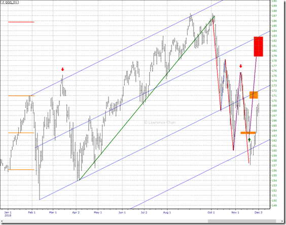
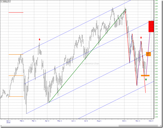
More wild swings since last update. Here is the QQQ daily chart with some interesting observations.

image

Red down arrows : Left one is the high of first quarter. Right one is the test of that high and failed to clear the resistance.

Red down trend lines: Drawn according to the 3 pushes down rule and the time is now up by Monday (Tuesday latest) for the down swing.

Green up arrow: QQQ bounced off the midpoint of January.

Purple up trend lines: If we get a measured move up from last week’s low, QQQ may shoot up to 179 quickly.

What do I think?

A bounce is due but it is more likely to be blocked at the orange zone 170-172 because of the channel resistance and January high.

How things develop from there depends on how QQQ behaves these coming two days.

The Trump Tweets That Changed the Market Direction: QQQ as of Nov 9, 2018

Are the tweets from Trump a well timed effort to pop the market higher right before the mid-term election? I will let you decide.

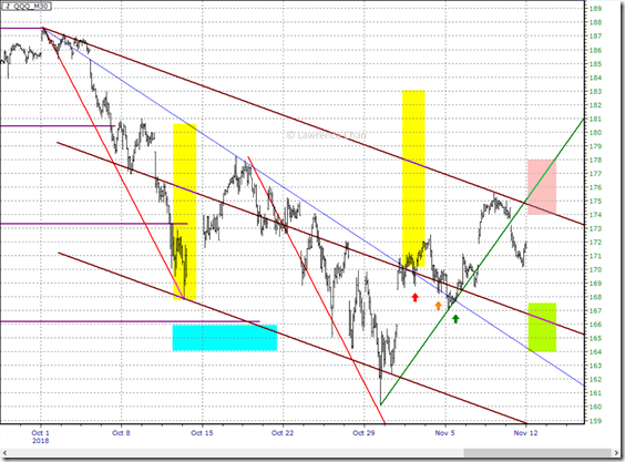
Following is a 30-minute chart of Nasdaq 100 ETF (QQQ).

image

Red Arrow Nov 1st around 10:15 am ET Trump tweeted about US-China Trade. US Stock Market took off. And I can no longer find that tweet.

Orange Arrow. Nov 2nd around 2:30 pm ET Trump tweeted again on US-China Trade when both US and China officials denied what his says. I cannot find this tweet either.

Green Arrow Nov 5th all morning rumors and then by 3:00 pm ET, announcement of polls showing GOP was leading.

All three attempts are done right at the moment that QQQ was about to flush lower. Much lower.

Because of the way the market being affected was so subtle, majority of the people who are not close enough to the markets are not aware of the subtle change in the dynamics. I am not going to name names but you all know who they are.

Short-Term Outlook

So what to expect from here.

1. As long as Friday low holds up, the red zone above will be in play and could happen very quickly.

2. Pushing into the red zone first without touching the green zone below, if resulted in a close below that, will point to another flush lower to the green zone eventually.

3. A very strong support zone is now built at the green zone below. Any selloff getting into that on the first try can lead to explosive rallies.

The whole situation with such wide target / action areas was the aftermath of the forced change in market direction.

Originally I hoped that we will have a calmer market (i.e. VIX < 15) after the election. Well we do not always get what we hope for, do we?

The messy swings will likely continue for at least a few more months.

Hang Seng Index as of Nov 2, 2018

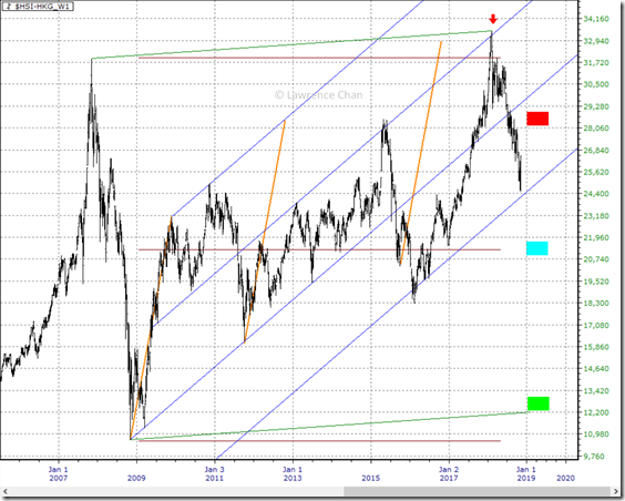
Hang Send Index weekly chart below.

image

1. Long term 3 pushes up completed at failure to clear the long term top

2. Up channel structure in potential trend change

3. As long as 2nd push up swing top (red zone) is not cleared, minimal downside target near midpoint of complete range (cyan zone)

4. 3 pushes up normal target is back to where it started (green zone)

5. If HSI manages to clear red resistance zone and hold above that on weekly closing basis, it will be able to challenge the all time high

Apple as of Nov 2, 2018

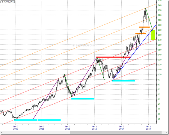
Apple weekly chart below.

image

1. Apple has 3 major runs higher since the year 2009 bottom. If we label the middle one as one unit of time, the first rally took two and the latest one has used one and a half units so far.

2. The current rally started from year 2016 is actually a parabolic run composes of two leg of equal length. Parabolic run often marks an important top or bottom for at least half the time spent on the run. So we are looking at 6 to 8 months consolidation.

3. Last 2 corrections / pullbacks (highlight in green down trendlines) are about 45-50 dollars each, if that repeats, we will see 190.

4. Key weekly pocket zones are 195, 182 and then 135.

5. Long term channel structure is intact with Apple completed the 150% expansion. It is normal to move back down to the midpoint of the expanded channel which is around 180 at the moment.

6. Up trendline in blue highlights the current support which is still very far down below.

7. So even if Apple somehow managed to make a new high against the 250% expansion boundary, it is still like to move back down to below 200. Longer it spends its time up there, longer and steeper the selloff will be.

A Tale of Amazon, Microsoft and Intel as of Nov 2, 2018

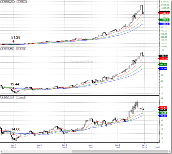
Long term players do not look at the charts like the active traders. They care much about the trend and the long term averages. Here is a chart of Amazon, Microsoft and Intel with their monthly 12, 24 and 36 period simple moving averages.

Are these long term players concerned?

Hint: Of course they are since the beginning of this year. That’s why we have this sell off.

image

The more important question: Are they willing to buy these market leaders now?

Update: What to Expect Next from QQQ as of Oct 27, 2018

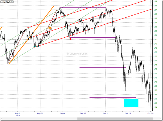
QQQ 30-minute chart below. All chart markings the same as the one from Oct 11. Obviously, the double top target is now tagged.

image

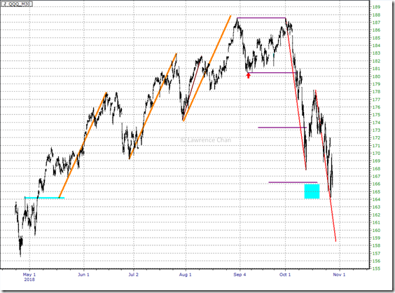
What to expect next? This we have to use STOPD to tell us whether the process is completed.

image

The start of this selloff was a rejection of 3rd quarter high. It swiftly dropped to right below 3rd quarter low (the higher red line) and bounced.

Then 2nd quarter high acted as resistance and sent QQQ down to the 3 pushes up target. But 2nd quarter high resistance implies 2nd quarter low (153-154) and potentially year low (150) being the targets.

So the price to watch out for is whether 3rd quarter low up to January high acting as resistance or not.

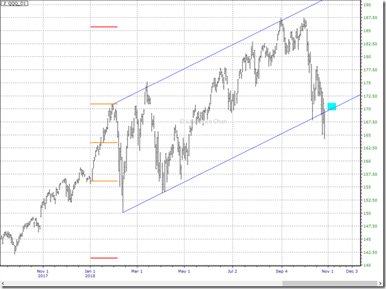
Interestingly, that lines up with the up channel bottom on daily that was just breached this week. See the chart below.

image

The orange lines highlight the January range. January being the open range for the year has already given us the top of the year so far by its 100% expansion to the upside. Failing to close above the resistance zone mentioned earlier (the cyan box) means we are likely going to see a drop to January low, year low so far and possibly expansion down to 140-142 area.

Update: Amazon as of Oct 27, 2018

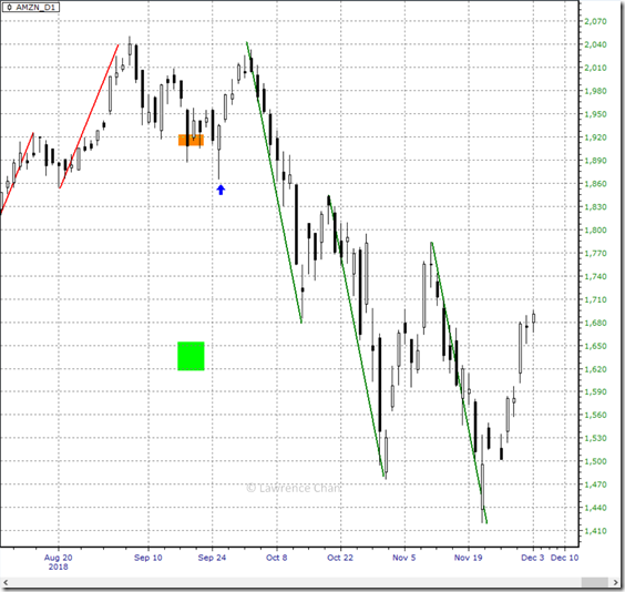
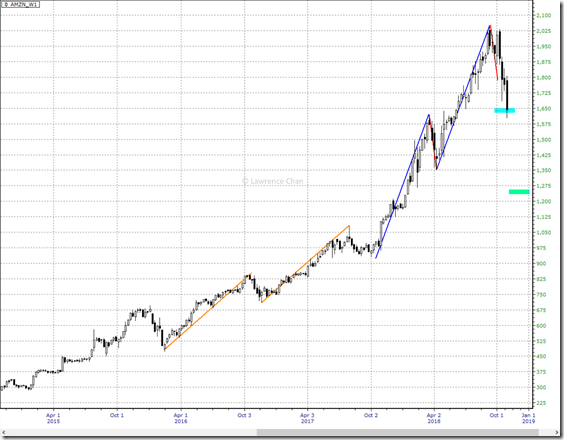
Amazon weekly chart below. First target tagged.

image

What to expect next?

If Amazon starts to bounce from here but fails to clear midpoint of this drop, the green zone below is the next downside target.

If the blue zone turns into resistance, it will be the nightmare scenario for bulls.