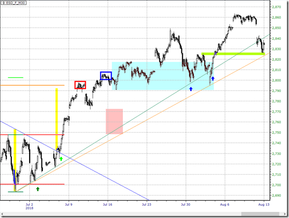
Since last post on S&P500 back on 15th July, it has been almost a month now. It is a good time to see if the projection made back then has worked out as expected. Following is an update 30-minute chart of Emini S&P.
Review
What was expected:
a. Consolidation likely
b. If we see a pullback, the red zone would be the support
What actually happened:
1. 3 weeks of consolidation (light blue zone) where the price keeps getting back to the same starting level (the blue box)
2. Pullback happened at a higher level without touching the support area (red zone)
Outlook
So what else happened:
3. S&P chose to hold the up trendline (the blue up arrows) giving it a go for new high
4. News shock past 2 days sent S&P back down to the pocket (lime zone) and bounced
What it means is that the up trend is intact with more upside likely.
What we cannot tell is what will happen at the all time high, which is just some 10 points above last week high, if and when S&P finally challenging that.
Shameless promotion: Chart reading can be simple and effective if you are doing it right, pick up your copy of The Art of Chart Reading today!

