Nice Catch Update: QQQ as of Aug 24th 2018

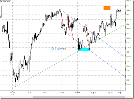
This is a follow-up on my post back on the 21st. This is the same 30-minute chart as of today.

image

Notice how QQQ (and Emini NQ too) holding up at the up trendline (green line) as support even though there was an external sell shock forced the price to move lower.

And now we have tagged the target (orange zone).

This example is a classic case that you hear all these bearish opinions publicized by the media, yet the markets are doing what they are supposed to do. Then the media (and TV personalities) blame the market for moving higher. Instead of telling the truth that they do not know what they are talking about, they make up more excuses to confuse the public.

Don’t let them.

You do not need fancy technical indicators or complicated analysis to trade profitably.

Learn to read price charts correctly today!
Nice Catch: QQQ as of Aug 20th 2018

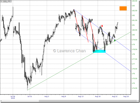
I was talking about Nasdaq 100 (QQQ and NQ) is ready for gap and go to much higher price level in my real-time commentary.

Here are some of the reasons directly from the chart.

image

On 30-min QQQ chart:

1. Down channel established as of Aug 13th (blue lines)

2. Intention to produce 3 pushes down (red lines)

3. Bounce from 3rd push materialized but blocked from going higher by the gap and forced to go lower when price re-entered the channel (red down arrow)

4. Up trendline established as of Aug 15th

5. Retest of swing low from Aug 15th also aligned with test of down channel.

6. On Aug 20th closed above channel, as long as price stays above the channel, or a bull flag on higher timeframe, will give us the last swing high (orange zone)

Many people assumed they know how to read a chart properly. Instead of accepting their ignorance, they choose to believe they already know everything in my book, The Art of Chart Reading.

Maybe, they have a collection of ideas how to read a chart. But that is not how it works. Chart reading has to be done systematically so that you can arrive at the proper conclusion with no bias from your personal opinions. And what I offer in the book is the framework to achieve exactly that.

What We Know About Tesla as of Aug 18, 2018

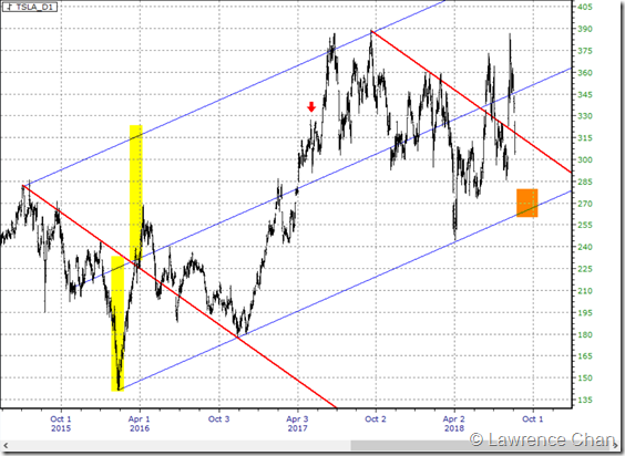
Here is a daily chart of Tesla.

image

1. Channel (blue lines) in the making since the late 2016 rally. Confirmed by mid 2017 test of channel top and subsequent consolidation.

2. Violent down trendline (red line, left) break gave us the target (red down arrow).

3. 2nd down trendline (red line, right) break gave us test of all time high and rejected. Potential trendline breakout failure.

4. Channel support (orange zone) down at 260 to 280.

5. Interestingly, Tesla is still in daily uptrend.

Struggle around the 2nd down trendline likely until clean setup of a bottom formed on weekly, or, breakdown below support zone that points to a flush below 200 likely.

S&P500 Review and Outlook Aug 11, 2018

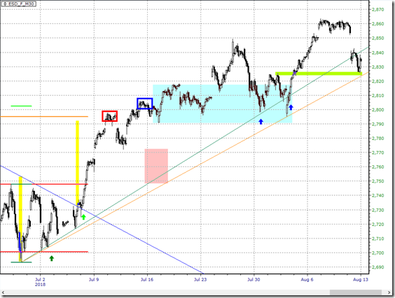
Since last post on S&P500 back on 15th July, it has been almost a month now. It is a good time to see if the projection made back then has worked out as expected. Following is an update 30-minute chart of Emini S&P.

image

Review

What was expected:

a. Consolidation likely

b. If we see a pullback, the red zone would be the support

What actually happened:

1. 3 weeks of consolidation (light blue zone) where the price keeps getting back to the same starting level (the blue box)

2. Pullback happened at a higher level without touching the support area (red zone)

Outlook

So what else happened:

3. S&P chose to hold the up trendline (the blue up arrows) giving it a go for new high

4. News shock past 2 days sent S&P back down to the pocket (lime zone) and bounced

What it means is that the up trend is intact with more upside likely.

What we cannot tell is what will happen at the all time high, which is just some 10 points above last week high, if and when S&P finally challenging that.

Shameless promotion: Chart reading can be simple and effective if you are doing it right, pick up your copy of The Art of Chart Reading today!

What We Know About Facebook Before the Drop

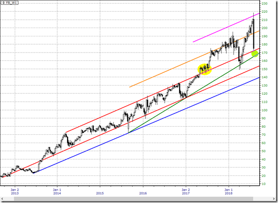
Here is a weekly chart of Facebook. We do know a lot about it before the earning disappointment.

image

1. The original channel has been in force for years (red lines)

2. Yellow zone marks the channel breakout

3. Orange line is the 100% expansion

4. Magenta line is the 200% expansion and the usual end of a run on first touch

5. Real support back down at the pale green zone

What’s the use of knowing the potential?

To name a few, protect your profit if you were long the stock, anticipation of Nasdaq 100 would have serious resistance to go much higher and, as a minimum, not to chase the stock of Facebook over the past month or two for long term holding.

Bitcoin Outlook July 26, 2018

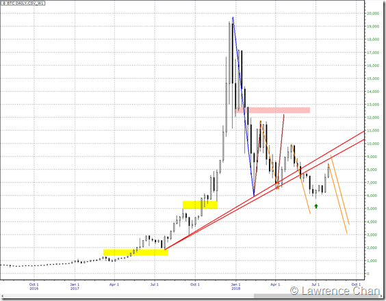
I mentioned what I think about Bitcoin in the book when Bitcoin was still trading above $8000 at the end of May 2018. Here is an update of what happened so far and the outlook in the near future.

image

Those of you who have read the book would recognize this chart. It is Bitcoin weekly.

The zone for which Bitcoin has to move down to, as stated in the book, is somewhere near the 5300-5600 zone.

When Bitcoin tagged 5700 (green up arrow) and bounced by end of June, we have a weekly level FBO against the first quarter high.

This signal a run back up to the nearest resistance which is highlighted by the 2 up trendlines in red.

Until Bitcoin can trade above that and stay above $10,000, the risk of it moving lower again is still pretty high.

If you are interested in learning my way of chart reading, go get my book The Art of Chart Reading today!

Nice Catch: S&P500 July 3 to July 13, 2018

Here is my trading analysis made during July 3 to July 13. The outlook was explained in my real-time commentary. Here is a recap of what I saw and the potential outlook from here.

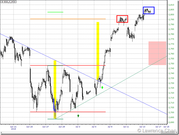
Following is a 30-min regular trading session (RTH) only chart of Emini S&P500 future contract.

image

By the end of the week of June 29, 2018. marked by the dark green up arrow, we have a very volatile week that swing back and forth almost 2% everyday.

Yet something very interesting happened – an inverse head and shoulders will be formed if the neckline at the top is cleared.

The red horizontal lines highlight the shoulders and the green horizontal lines highlight the head.

The best moment for jumping into this move is marked by the bright green arrow for which a confirmed 1-2-3 buy happened.

The target highlighted by the red box is expected to at least give us a pause using my trend line targeting method.

The blue box highlights the Inverse Head and Shoulders target for which consolidation and pullback is likely to follow.